
One of the most common questions I received when consulting Power BI is about performance, such as “Why it takes so long to run a dashboard?” or “How can I make it faster?”
There are many factors related to performance. Before jumping into each one or just sharing a list of tips, I want to show you how to self-diagnose so that you can classify the possible reasons, identify the root cause, and focus on crucial issues!
Content
- Identify the steps when creating a dashboard
- Understand the user behavior before setting the objective
- The 80/20 principle
- Use Performance Analyzer to identify the problem
- Use DAX Studio for further analysis
- Take actions based on the insight
- Conclusion

First, let’s have an overview of the process when creating a dashboard.
There are three steps:
- Import
- Query
- Visualization
Understand the user behavior before setting the objective
How fast is fast enough? Fast and slow are subjective. If it’s a financial dashboard for C-level, the expectation can be high as the dashboards are usually consuming in commute with short attention span, such as checking the dashboard on the phone in a taxi. On the contrary, the waiting time can be longer in the software testing scenario as the amount of data is heavy and even refreshing a database takes time. BI developers are busy, so try to focus on things that are making an impact.
The 80/20 principle
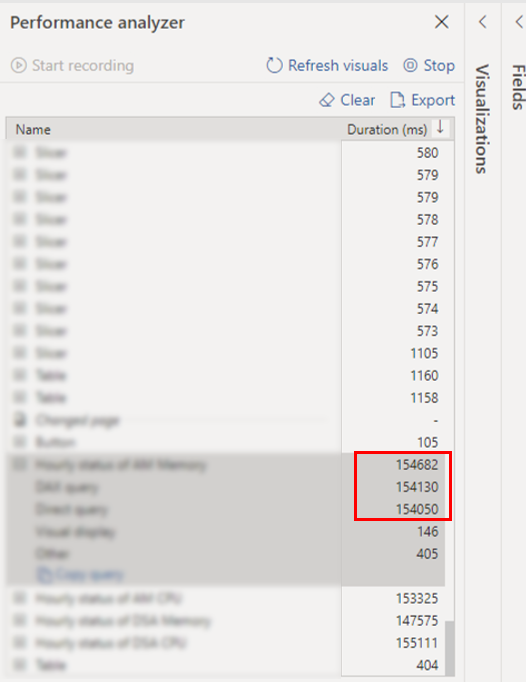
In many cases, 80% of latency comes from less than 20% of Visuals in a dashboard. The Performance Analyzer helps us to identify those.
Use Performance Analyzer to identify the problem
Open Power BI Desktop, click View at the top. Once choose Performance Analyzer, you will see the function appears on the right side. After clicking Start Recording, the analyzer record the time spend on refreshing. I recommend recording after you changed a new page to simulate the user experience.
In the example shown in the following image, the most time-consuming one is under the Query category, meaning there are rooms to improve in DAX. If it is under the Visual Display category, you may want to change a different visual. In most cases, the native visuals provided by Power BI have better performance.
The following images demonstrate the before and after tuning. It took more than 120 seconds to refresh a dashboard. After turning, it took less than 4 seconds.

Use DAX Studio for further analysis
Let’s say we’ve classified the duration are spent the most in Query. I’ll recommend using DAX Studio for further analysis. DAX Studio is a tool to write, execute, and analyze DAX queries in Power BI, Excel, and Analysis Service Tabular. For more details, please check here.
If it’s your first time using DAX Studio, feel free to refer to the following steps to connect.
After downloaded DAX Studio, please open it and click File → Open to link with a Power BI Report.

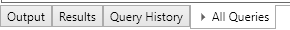
Click All Queries.

Don’t forget to drag the cards into All Queries.
Drag the cards into All Queries.
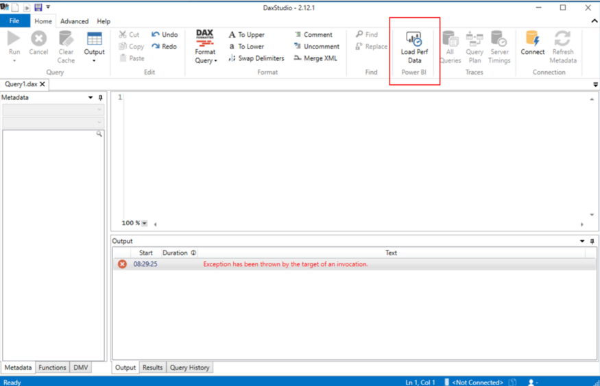
Now you are ready to analyze the Power BI report.
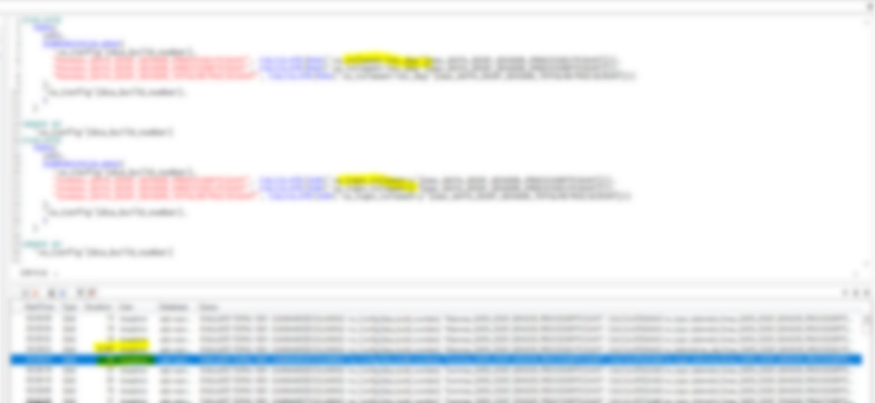
From the image below, we can examine the steps in a Query and the duration. It helps us to identify the most time-consuming query and analyze how to improve.
Take actions based on the insight
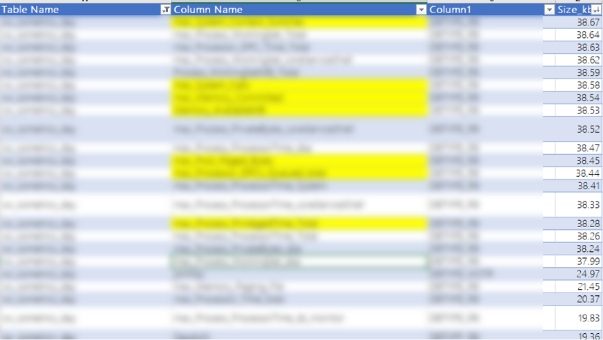
DAX Studio also calculates the size of each column. Please don’t underestimate the power of it. I had a customer who found it very insightful. In practice, database administrators and analysts have different levels of permissions, so it’s not surprising when the analyst doesn’t know the size of a column and may lose a chance to identify the root cause of latency.
The image below shows a list of a column by size. The rows marked in yellow were heavy but not in use in the dashboard. I then asked the customer to double-check how many columns are needed? It turns out there are only 30 columns out of 400 are in need. After cleaning the data and bring just what they need, the file size has reduced tremendously. It does not only make it easy to transfer, but the performance also improved.
Conclusion
Performance Analyzer and DAX Studio are two tools I use for self-diagnose. I like that they are easy to use and help us focus on the area to drill down. After all, it’s more helpful to identify the root cause than simply saying, “It’s too slow.”
Next time, if you face a similar issue, ask some follow-up questions to decompose the problem and support it with data.
Some example questions:
- How long it takes to refresh a report?
- Which visual spend the most time?
- Which steps are the most time-consuming? Import, Query, or Visualization?
- Is this visual necessary to tell the story?
- Do we need all the columns import into the dataset?